library(httr2)Warning: package 'httr2' was built under R version 4.4.3library(jsonlite)
library(dplyr)
library(ggplot2)
library(DT)Warning: package 'DT' was built under R version 4.4.3Querying, visualizing, and comparing forest cover data from the GJD API
In this use case we will walk through a common research scenario: downloading forest cover data for a specific jurisdiction and time period from the GJD API, displaying the results in an interactive table, visualizing them with a bar chart, and finally comparing two jurisdictions side by side.
We will query forest cover data for Caquetá and Putumayo (Colombia) from 2010 to 2019, using data published by IDEAM (Colombia’s national environmental authority).
Make sure you have completed the Get Started and API Authentication sections before running this notebook.
library(httr2)Warning: package 'httr2' was built under R version 4.4.3library(jsonlite)
library(dplyr)
library(ggplot2)
library(DT)Warning: package 'DT' was built under R version 4.4.3The GJD API endpoint for place-level data follows this pattern:
https://api.greenjurisdictions.org/api/v1/dataPlaces/{groupByCountry}/{groupByJurisdiction}/{groupByMunicipality}With query parameters to filter by topic, country, jurisdiction, years, and source.
For our first query we focus on Caquetá:
| Parameter | Value | Meaning |
|---|---|---|
ID_Topic |
120 |
Forest cover |
ID_Countries |
["CO"] |
Colombia |
ID_Jurisdictions |
["CO-CAQ"] |
Caquetá |
ID_years |
["2010", ..., "2019"] |
Years 2010–2019 |
ID_sources |
[14] |
IDEAM, Colombia |
base_url <- "https://api.greenjurisdictions.org/api/v1/dataPlaces/false/true/false"

years <- paste0('"', 2010:2019, '"', collapse = ",")

query_caqueta <- list(
  ID_Topic         = 120,
  ID_Countries     = '["CO"]',
  ID_Jurisdictions = '["CO-CAQ"]',
  ID_Municipalities = '[]',
  ID_years         = paste0("[", years, "]"),
  ID_sources       = '[14]'
)response_caq <- request(base_url) |>
req_url_query(!!!query_caqueta) |>
req_headers(
"X-API-TOKEN" = Sys.getenv("GJD_API_KEY"),
"Accept" = "application/json",
"Content-Type" = "application/json"
) |>
req_perform()
cat("HTTP status:", resp_status(response_caq), "\n")HTTP status: 200 The API returns a JSON object with the following structure:
message: Status messagestatus: "success" or "error"data.data: Array of recordsdata.total_data: Total number of recordsbody_caq <- resp_body_json(response_caq, simplifyVector = TRUE)
cat("Message:", body_caq$message, "\n")Message: Resources retrieved successfully. cat("Total records:", body_caq$data$total_data, "\n")Total records: 10 We extract the data.data array into a data frame:
df_caq <- body_caq$data$data |>
  as_tibble() |>
  mutate(
    value = as.numeric(value),
    year  = as.integer(year)
  ) |>
  select(year, jurisdiction, value, unit, source) |>
  arrange(year)

glimpse(df_caq)
Rows: 10
Columns: 5
$ year <int> 2010, 2011, 2012, 2013, 2014, 2015, 2016, 2017, 2018, 2019
$ jurisdiction <chr> "Caquetá", "Caquetá", "Caquetá", "Caquetá", "Caquetá", "C…
$ value <dbl> 6752222, 6716987, 6681752, 6651624, 6626107, 6602787, 657…
$ unit <chr> "hectares", "hectares", "hectares", "hectares", "hectares…
$ source <chr> "IDEAM, Colombia", "IDEAM, Colombia", "IDEAM, Colombia", …df_caq |>
datatable(
caption = "Forest cover in Caquetá, Colombia (2010–2019)",
colnames = c("Year", "Jurisdiction", "Forest Cover", "Unit", "Source"),
options = list(
pageLength = 10,
dom = "tip"
),
rownames = FALSE
) |>
formatRound("value", digits = 2, mark = ",")Let’s create a bar chart to see the trend over time. We convert the values to millions of hectares for readability.
ggplot(df_caq, aes(x = factor(year), y = value / 1e6)) +
  geom_col(fill = "#2b7a78", width = 0.7) +
  geom_text(
    aes(label = sprintf("%.2f", value / 1e6)),
    vjust = -0.5, size = 3, color = "#17252a"
  ) +
  scale_y_continuous(
    labels = scales::comma_format(suffix = "M"),
    expand = expansion(mult = c(0, 0.08))
  ) +
  labs(
    title    = "Forest Cover in Caquetá, Colombia (2010–2019)",
    subtitle = "Source: IDEAM, Colombia — via GJD API",
    x        = "Year",
    y        = "Forest cover (million hectares)"
  ) +
  theme_minimal(base_size = 13) +
  theme(
    plot.title    = element_text(face = "bold"),
    panel.grid.major.x = element_blank()
  )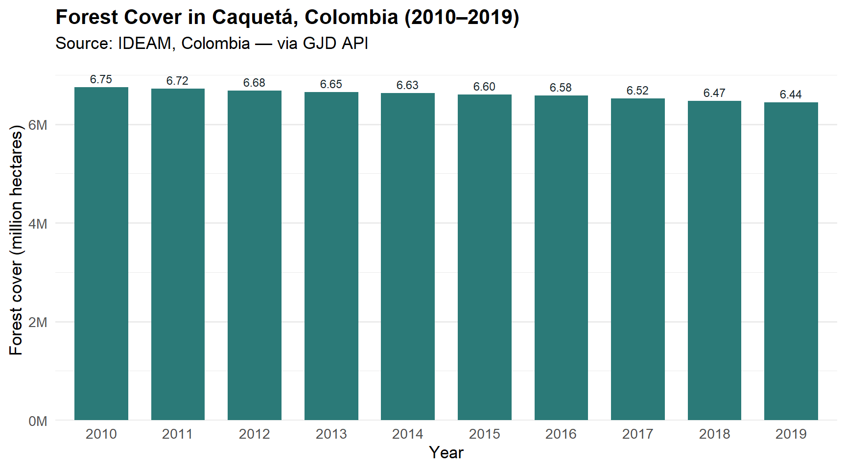
The chart confirms a steady decline in forest cover throughout the decade.
Our researcher now wants to compare Caquetá with a neighboring jurisdiction: Putumayo. Instead of making two separate requests, we can query both jurisdictions in a single API call by passing ["CO-CAQ", "CO-PUT"] as the ID_Jurisdictions parameter.
query_comparison <- list(
  ID_Topic         = 120,
  ID_Countries     = '["CO"]',
  ID_Jurisdictions = '["CO-CAQ","CO-PUT"]',
  ID_Municipalities = '[]',
  ID_years         = paste0("[", years, "]"),
  ID_sources       = '[14]'
)

response_cmp <- request(base_url) |>
  req_url_query(!!!query_comparison) |>
  req_headers(
    "X-API-TOKEN"  = Sys.getenv("GJD_API_KEY"),
    "Accept"       = "application/json",
    "Content-Type" = "application/json"
  ) |>
  req_perform()

cat("HTTP status:", resp_status(response_cmp), "\n")
HTTP status: 200 body_cmp <- resp_body_json(response_cmp, simplifyVector = TRUE)
cat("Total records:", body_cmp$data$total_data, "\n")Total records: 20 df_cmp <- body_cmp$data$data |>
as_tibble() |>
mutate(
value = as.numeric(value),
year = as.integer(year)
) |>
select(year, jurisdiction, value, unit, source) |>
arrange(jurisdiction, year)
df_cmp |>
datatable(
caption = "Forest cover: Caquetá vs Putumayo (2010–2019)",
colnames = c("Year", "Jurisdiction", "Forest Cover", "Unit", "Source"),
options = list(
pageLength = 20,
dom = "tip"
),
rownames = FALSE
) |>
formatRound("value", digits = 2, mark = ",")Now we visualize both jurisdictions together using a grouped bar chart, making it easy to see how they compare year by year.
ggplot(df_cmp, aes(x = factor(year), y = value / 1e6, fill = jurisdiction)) +
  geom_col(position = "dodge", width = 0.7) +
  scale_fill_manual(
    values = c("Caquetá" = "#2b7a78", "Putumayo" = "#3aafa9")
  ) +
  scale_y_continuous(
    labels = scales::comma_format(suffix = "M"),
    expand = expansion(mult = c(0, 0.08))
  ) +
  labs(
    title    = "Forest Cover: Caquetá vs Putumayo (2010–2019)",
    subtitle = "Source: IDEAM, Colombia — via GJD API",
    x        = "Year",
    y        = "Forest cover (million hectares)",
    fill     = "Jurisdiction"
  ) +
  theme_minimal(base_size = 13) +
  theme(
    plot.title       = element_text(face = "bold"),
    panel.grid.major.x = element_blank(),
    legend.position  = "top"
  )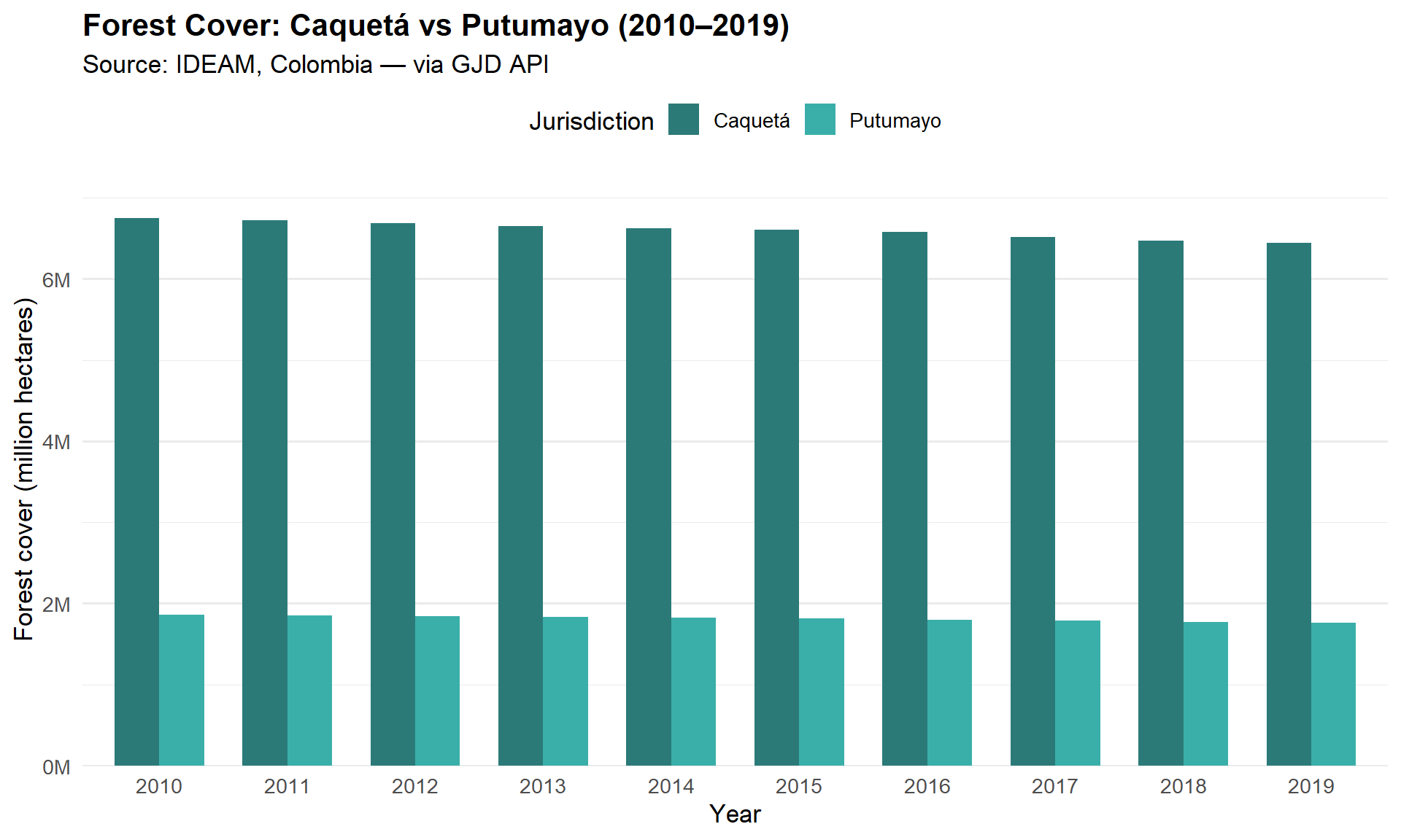
The comparison reveals that Caquetá has roughly 3.5 times more forest cover than Putumayo, but both jurisdictions follow a similar downward trend over the decade.
In this use case we learned how to:
httr2 with the X-API-TOKEN header.DT.ggplot2.